Design project
Time is money
Project
Build a trading app from scratch
Target group
1) Traders who are using other traditional trading app
2) Traders who are using desktop for trading
Highlight of design procedure
1) Search function to help access multi categories of setting
2) A/B test for "on/off" toggle feature
Which is the most value added part?
The left three screens are demonstrating the flow of doing a trade on one page only. Here is an expandable bar allows trader to select and confirm the details of placing order, they can view the real time information like price trend at the back of the layer.
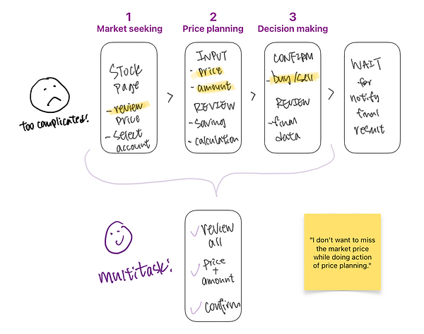
According to finding from customer journey, traditional trading app needs to go through at least 3 pages for confirming the order. Trader may miss the latest market price at the same time also. We understood that time is money while doing every single trader from trader. Can the complicated procedure be grouped into one page?
“Review” page is already a long page for stock’s information, it would not be a good user experience if putting “Action 1” and “Action 2” page at the bottom. After usability test, we studied the feasibility with technical team.
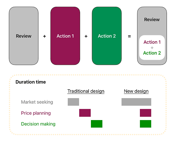
The final proposal is grouping “Action 1” and “Action 2” as a top layer of “Review” page. As there are many selections button on “Action 1” and “Action 2”, we prioritized the using frequent of the buttons and suggested to make it as an expandable layer.
There is a big improvement on the duration time and allows trader to have multi functions for quick and accurate decision.


